Themed

Sub

Gifting

A quick experiment validated a business opportunity and became a permanent feature for Twitch’s most valuable support experience.

A sentiment experiment
Since it was introduced in 2018, Subscription Gifting had become one of the most popular ways for dedicated viewers to support creators they loved. Sub Gifting allowed for contributions of up to $500 while providing as many as 100 unsubscribed viewers a free trial of the subscriber experience.
While Sub Gifting provided material benefits for creators, the value of Sub Gifting to dedicated viewers was almost entirely emotional -- it was about recognition, belonging, and the satisfaction of supporting a creator and community they loved. But Sub Gifting, unlike other methods of support, offered no way for a supporter to express the sentiment behind their contribution.
As I was validating hypotheses around Twitch’s opportunity in the alerts space, Sub Gifting presented itself as a ideal test bed for a live experiment. Our goal was to see whether we could increase gifting behavior by facilitating viewers’ emotional expression in conjunction with their gift.
If this experiment was successful, it would support our conviction that we could drive spending behavior overall by amplifying the emotional value of supportive moments.
Defining our approach
Other methods of support on Twitch already had solutions for conveying sentiment. Continuing subscriptions allowed a resubscribing viewer to add a custom text message that would show up in chat (and often the accompanying on-screen alert). Cheering, one of Twitch’s other methods of live support, was built around the expressive pictorial language for which Twitch is famous and offered a range of emotive possibilities via animated “Cheermotes.”
For Sub Gifting, we preferred a visual approach to sentiment. User-generated text would increase customer friction, both at text-entry and at point of purchase, and also increase safety hazards. Mediating sentiment with alert “themes” would allow us to move faster and incur less risk.
What’s in a theme?
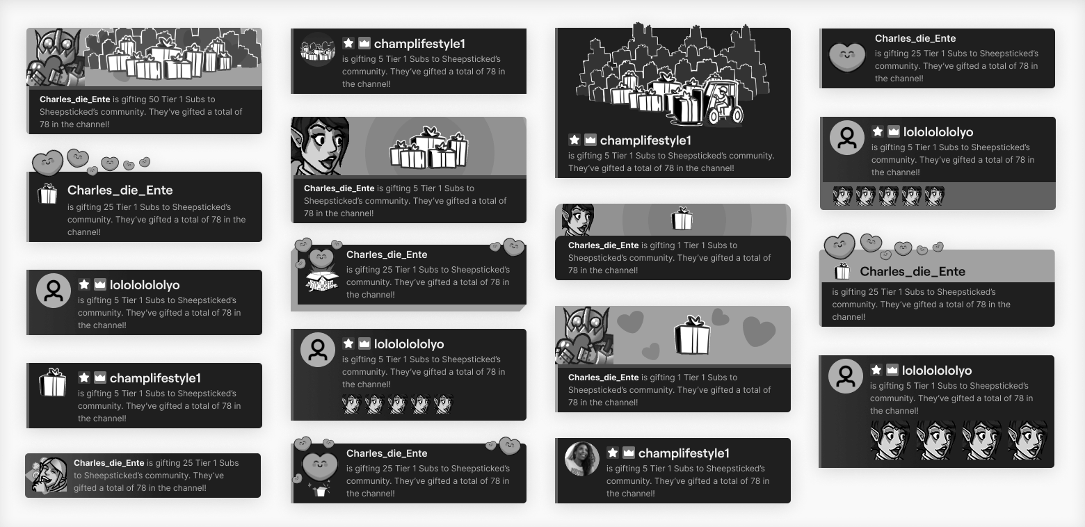
In order for themes to make gifting more desirable to viewers, the first thing we needed was a place where the themes could be seen by viewers and creators. The obvious answer was chat “user-notices,” an existing feature. User-notices were simple cards automatically posted in chat, by Twitch, in response to channel events such as Subscriptions, Channel Point redemptions, etc. User-notices provided basic acknowledgement of the event and recognition for the viewer who performed the action.
We also needed to design themes that communicated common sentiments in ways that felt fun and authentic to viewers and creators. In collaboration with Twitch UX Research, we identified a set of sentiments commonly conveyed on Twitch in chat, in custom messages, and verbally by creators:
  • Love
  • Celebration
  • LUL
  • Sadness / Regret
In the exploration phase, I leaned into the ways these sentiments were already being mediated on Twitch via global emotes, channel emotes unique to a particular creator, and animated “cheermotes” used with the Bits microcurrency.
For the final designs, I started with a combination of cheermotes and high-resolution emotes. I manually customized the animation of each element, and then used repeated elements to wreath the user-notice with an additional animation. The individual elements would continue to provide motion and life to the theme as long as the user-notice remained in chat.
Finding the opportune moment
Themes were designed to add value to the gifting experience, but adding a theming choice-point also means additional friction between customers and their desired outcome. I needed to ensure the value added by themes was greater than the cost of choosing a theme, and that customers who weren’t interested in theming their Sub Gift were minimally impacted.
The first step in reducing friction was to choose the best point in the end-to-end flow to present theming options to Gifting customers. I sought a solution that would minimize friction for all customers and closely align to their expectations. I examined four potential options, illustrated below:
  1. Before SKU selection
  2. After SKU selection
  3. During checkout
  4. Post-purchase
Options 2 and 4 created too much friction -- each added a discrete step to the flow which required at least an additional click or tap from every customer. Option 3 created friction of a different sort, in that it extended the customer’s time-spent with the video obscured. While Option 3 presented themes in a less-noisy environment, this pattern is often used on other sites for paid upsells (which Themes were not).
In light of this analysis, my cross-functional partners and I landed on Option 1, “before SKU selection.” While this option presented theming in a noisier environment, it offered the lowest overall friction for customers and also allowed the idea of adding a theme to influence SKU selection.
Designing a frictionless preview
The Subscription Gifting panel on web also needed a facelift in order to seamlessly support the theming experience.
In order to reduce ambiguity around this new addition to the Gifting experience, Sub Gifting customers needed a way for to preview the themes before making their decision. I sought preview solutions that could display seamlessly in-panel, to reduce development costs and complexity for the customer.
The current Gifting panel displayed Gifting SKUs in a 2x3 grid, with each SKU prominently featuring complex, multicolored illustrations. There was nothing in this design that could reasonably proxy a user-notice for the purpose of previewing, and I was concerned that the noisy illustrations were already pushing the amount of visual complexity this panel could reasonably contain.
I redesigned the SKU displays to full-width rows and reduced the noise and complexity of the associated illustrations. These changes allowed the top SKU to serve as a preview surface, reduced overall visual complexity, and minimized the growth in panel height despite adding a new control.
Building for feelings
The value of themes lay in how well they communicated visually, and to that end each theme was designed and animated specifically to express its intended emotion. However, the engineering lead available for the experiment had limited experience with front-end experiences and was concerned about their ability to translate this emotionality in code.
I provided the engineering lead with detailed spec sheets that removed the guesswork and allowed them to build the themes as designed, step by step. This ensured the animations retained their emotional nuance in the final experience and also reduced overall development time.
A successful experiment, plus a new feature
The Themed Sub Gifting experiment was rolled out to 20% of monetizing channels across Twitch. After six weeks of data, results showed a ~3% lift in gifting behavior on experimental channels.
This buoyed our confidence that larger programs like Alerts  could successfully drive support behavior by helping creators amplify the emotionality of these moments. It also made a case for facilitating viewers in further customizing the way their contributions are celebrated on-screen.
As an unexpected bonus, Monetization org leadership made the decision to promote Themed Sub Gifting from “experiment” to “feature” and extend the experience to all monetizing channels.
Other Work